
Using Colour Palettes
When I first discovered colour scales, and started to move away from the simple R base graphics col = "red" style of notation, it took me a while to figure out how to actually use a colour scale in R - how to break it up into distinct colours and tell a plotting function which colour to use for what. When I get stuck on something, I often make a note of it, thinking that once I figure it out, it might be worth a blog post… so here we are.
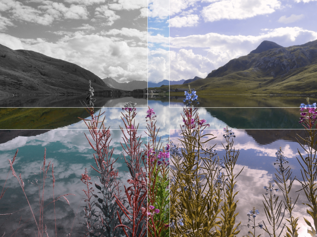
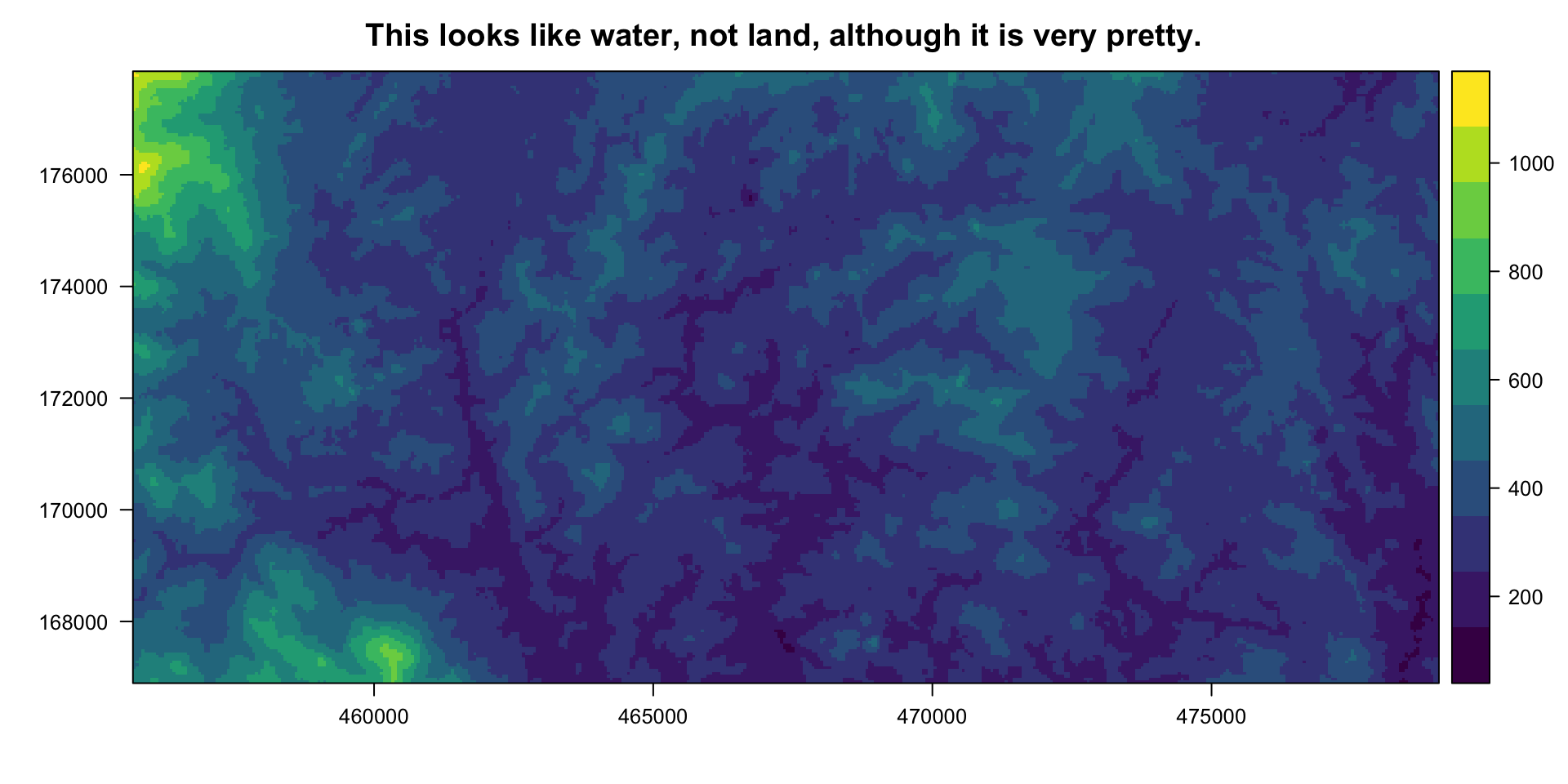
Lago di Tom, Ticino, Switzerland
Where to get your colour palettes
There are lots of packages out there for using and building colour palettes. I’m especially a fan of the viridis package, which has colour scales that have been designed with colour vision deficiencies and greyscale printing in mind. They’re also really pretty (again, check out the “ocean” topo map above).
The Color Brewer 2.0 website is a great site for playing around with some different colour palettes, and you can specify if you want “colorblind safe” and/or “print friendly”. These palettes are available in the RColorBrewer package, or if you prefer tidyverse, the Color Brewer palettes are available in the ggplot2 package (check out this website for more details). Alternatively, the Color Brewer 2.0 website gives you the hex codes for each colour in each palette (choose “HEX” from the dropdown list in the bottom-right option panel), and you can use those directly in R.
I also recently discovered the the colorRampPalette function, and I really like its versatility and simplicity. While there are a lot of resources online already for other colour palette generators, I had trouble finding info about this function (please post any links in comments though, if I’ve missed good resources!) so that’s what I’ll focus on from here out…
Using the colorRampPalette function
The colorRampPalette function allows you to create your own colour scales, basically joining together any colours that you want. In its simplest form, the function takes 1 single argument: a vector of input colours that you’d like to have joined together in a colour scale. I like to use this R color reference chart to pick my input colours by name, but the function can also take #rrggbb or #rrggbbaa hexadecimal strings.1
The basic implementation of colorRampPalette is:
- Build your colour scale.
- Chop up the colour scale into as many pieces (discrete colours) as you need.
- (Optional) Specify which colours you want to use.
Let’s look at this in more detail, with some examples.
1. Build your colour scale.
Run the colorRampPalette() function on a concatenated vector of the colours that you want to ramp together into a colour scale, and save this as an ‘object’. Example:
# create your scale
greekIslandsColours <- colorRampPalette(c("gold", "white", "deepskyblue", "blue"))

# look at it
par(mar = c(0,0,0,0))

image(seq(1, 1000), 1, matrix(seq(1,1000), 1000,1),
      col = greekIslandsColours(1000),
      axes = FALSE, ann = FALSE)
2. Chop up the colour scale into discrete colours.
What the colorRampPalette() function actually does is not creat an ‘object’ but rather it creates a new function, in this case called topoMapColours, that takes an argument, a numeric n, that specifies how many discrete colours you want your colour scale to be chopped up into. When you run this function, the output is the hex codes for n discrete colours within the full colour scale. Example:
greekIslandsColours(10)
##>  [1] "#FFD700" "#FFE455" "#FFF1AA" "#FFFFFF" "#AAE9FF" "#54D4FF" "#00BFFF"
##>  [8] "#007FFF" "#003FFF" "#0000FF"

# if you want, you can save these hex codes as a vector of character strings
greekIslandsColours10vec <- greekIslandsColours(10)
greekIslandsColours10vec
##>  [1] "#FFD700" "#FFE455" "#FFF1AA" "#FFFFFF" "#AAE9FF" "#54D4FF" "#00BFFF"
##>  [8] "#007FFF" "#003FFF" "#0000FF"
You can visualize these colours using the image function (as I did for the full colour ramp in the previous section), or a simple function I wrote that I like a bit better…
par(mar = c(0,0,0,0))

# option 1, the image function
numberOfColours <- 10
image(seq(1, numberOfColours), 1,
      matrix(seq(1,numberOfColours), numberOfColours,1),
      col = greekIslandsColours(numberOfColours),
      axes = FALSE, ann = FALSE)
Notice the optical illusion of how each colour band appears to be it’s own small colour ramp. Now try this instead…
par(mar = c(0,0,0,0))

# option 2, my barplot function
seepalette <- function(paletteName, numOfColours, whichOnes) {
  if(missing(whichOnes)) {
    whichOnes <- c(1:numOfColours)
  }
  barplot(rep(1,length(whichOnes)),
          col = paletteName(numOfColours)[whichOnes],
          border = NA,
          axes = FALSE)
}

seepalette(greekIslandsColours,10)
Better! This function essentially makes a bar plot, with one bar per colour. Note that this function takes up to 3 arguments:
paletteName
This is the name of the palette you created with colorRampPalette() (or any palette, ex. viridis)
numOfColours
This is the number of discrete colours that you want to break your colour scale into.
whichOnes
(Optional) This is a numeric vector specifying which colours you want to see, if not all of them…
3. (Optional) Specify which colours you want to use.
For whatever reason, although you want to break your colour scale into a certain number of colours, you might not want to use them all - perhaps you find some of the colours to be too bright or two dark, or too much of a mix of two contrasting colours, so you want to drop those ones, and just use the other colours. In that case, you can use the whichOnes option in seepalette() to visualize your palette with only the colours you want, and you can specify the hex codes output just as you would specify selecting certain vector elements. Example:
par(mar = c(0,0,0,0))

# look at the full palette again
seepalette(greekIslandsColours, 10)
# look at the palette without the palest yellow and the third-to-last blue
seepalette(greekIslandsColours, 10, c(1,2,4:7,9,10))
# save this modified topoMapColours palette so you can use it somewhere
greekIslandsColours8vec <- greekIslandsColours(10)[c(1,2,4:7,9,10)]

# compare the hex codes generated by the original and the modified palettes
greekIslandsColours10vec
##>  [1] "#FFD700" "#FFE455" "#FFF1AA" "#FFFFFF" "#AAE9FF" "#54D4FF" "#00BFFF"
##>  [8] "#007FFF" "#003FFF" "#0000FF"
greekIslandsColours8vec
##> [1] "#FFD700" "#FFE455" "#FFFFFF" "#AAE9FF" "#54D4FF" "#00BFFF" "#003FFF"
##> [8] "#0000FF"
Plotting a topographic raster
Here is an example using the colorRampPalette function. I won’t go into much detail about the other aspects of the code, cause for now, I just want to focus on colours…
Let’s start with the topo map of my field site in East Borneo that is earlier in the blog post. I got the DEM (Digital Elevation Model) file for this area from the USGS EarthExplorer website. If you just want to play around with my example, you can start by going to my github and downloading this DEM file. Save it into your working directory, or wherever you want to pull it from. And here’s the rest of the code…
#laod the packages we'll need
library(raster)
library(rasterVis)
library(ggplot2)

# load your DEM file as a raster
DEM <- raster("whatever-directory-you've-got-it-in/ASTGTM2_N01E116_dem.tif")
# compute the minimum and maximum values of the raster
DEM <- setMinMax(DEM)
# project the raster to the correct UTM zone (in this case, 50N)
DEMproj <- raster::projectRaster(DEM, crs="+proj=utm +zone=50 +north +ellps=WGS84")
# these values are the min and max X and Y coords of my field data + a large buffer
xmin <- 455682
xmax <- 479058
ymin <- 166892
ymax <- 177855
# save them as an extent object
ext <- extent(xmin, xmax, ymin, ymax)
# crop the DEM to the above extent
DEMprojCrop <- crop(DEMproj, ext)
# make the topo colour scale
clrtopo <- colorRampPalette(c("olivedrab2", "darkgoldenrod2",
"darkgoldenrod4", "chocolate4"))
# plot the raster
levelplot(DEMprojCrop,
cuts = 10,
col.regions = clrtopo(15)[2:12],
margin = FALSE,
main = "Et voilà, it's a topo map.")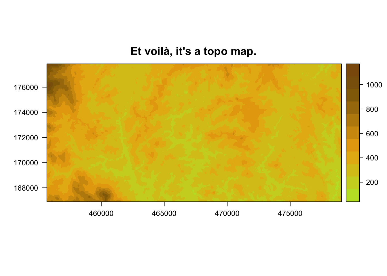 I used the
 levelplot function from the rasterVis package to plot this raster check out this website for more info about rasterVis.
Note the colour-related arguments that I’ve used in the levelplot function:
cuts = 10means that I want the elevation values to be ‘cut’ ten times - i.e. I want 11 different levels of elevation.col.regions = clrtopo(15)[2:12]means that I want those 11 different levels of elevation (or ‘regions’) to each get one of the 2nd to 12th colours in the clrtopo colour scale, when it is divided into a 15-colour palette.
Colouring points by factor level
Setting aside the colorRampPalette function for now, I want to also just do a quick example of how to colour points in a plot based on the factor levels of a certain variable in your data. I get asked about this sometimes, so I figure I might as well add it here, while I’m on the subject of colours. To keep things interesting, I’ll add jitter points over a boxplot - I use a lot of these types of plots in presentations of my research.
I’ll do this example, twice - in base R graphics and in ggplot2 (which I’m just learning now, so bear with me…).
First, let’s generate some data that mimics orangutan daily travel distances (DTD) during times of low, medium, and high habitat fruit abundance:
set.seed(100)

#make a dataframe of 20 observations of DTD during each fruit condition,
#and assign 4 individuals to the observations at random
df <- cbind.data.frame(Fruit = c(rep("LOW", 20), rep("MED", 20), rep("HIGH", 20)),
                       DTD = as.numeric(c(rnorm(20, mean = 600, sd = 100),
                               rnorm(20, mean = 700, sd = 120),
                               rnorm(20, mean = 950, sd = 80))),
                       Indiv = sample(c(rep("Roger", 11), rep("Pi", 20), rep("Luaqlas", 15), rep("Sles", 14))))

head(df)
##>   Fruit      DTD   Indiv
##> 1   LOW 549.7808      Pi
##> 2   LOW 613.1531    Sles
##> 3   LOW 592.1083      Pi
##> 4   LOW 688.6785 Luaqlas
##> 5   LOW 611.6971      Pi
##> 6   LOW 631.8630   Roger

str(df)
##> 'data.frame':   60 obs. of  3 variables:
##>  $ Fruit: Factor w/ 3 levels "HIGH","LOW","MED": 2 2 2 2 2 2 2 2 2 2 ...
##>  $ DTD  : num  550 613 592 689 612 ...
##>  $ Indiv: Factor w/ 4 levels "Luaqlas","Pi",..: 2 4 2 1 2 3 4 4 2 3 ...

#make Fruit an ordered factor
df$Fruit <- factor(df$Fruit, levels = c("LOW", "MED", "HIGH"), ordered = TRUE)

str(df)
##> 'data.frame':   60 obs. of  3 variables:
##>  $ Fruit: Ord.factor w/ 3 levels "LOW"<"MED"<"HIGH": 1 1 1 1 1 1 1 1 1 1 ...
##>  $ DTD  : num  550 613 592 689 612 ...
##>  $ Indiv: Factor w/ 4 levels "Luaqlas","Pi",..: 2 4 2 1 2 3 4 4 2 3 ...
Next, since I want to (eventually) colour the data points by individual, I need a colour palette of 4 distinct colours. I’m going to use the plasma palette from the viridis package. I don’t want the very bright yellow from the far end of the plasma spectrum, so I’m going to cut the spectrum up into 5 chunks, but only take the first 4…
par(mar = c(0,0,0,0))
library(viridis)

seepalette(plasma,5)
seepalette(plasma, 5, 1:4)
indivcols <- plasma(5)[1:4]
indivcols
##> [1] "#0D0887FF" "#7E03A8FF" "#CC4678FF" "#F89441FF"
Now that I’ve got my vector of hex codes for my 4 individual colours, I’ll make a boxplot with the datapoints overlayed and coloured by individual, using R base graphics syntax…
Because the col argument that assigns colours to the points in the points() function must be given a vector of the same length as the data, the first thing I’ll do is add a new column to my dataframe df which is the colour hex codes matched by individual (I could also just leave this as a separate vector, but I like to have it attached to my data).2
#add a column of colours, based on the Indiv column
df$IndivColours <- NA #initialize the column, then dump the hex vals into the right places
df$IndivColours[which(df$Indiv == "Luaqlas")] <- indivcols[1]
df$IndivColours[which(df$Indiv == "Pi")] <- indivcols[2]
df$IndivColours[which(df$Indiv == "Roger")] <- indivcols[3]
df$IndivColours[which(df$Indiv == "Sles")] <- indivcols[4]

#plot it
boxplot(df$DTD~df$Fruit,
        ylim = c(0,1200),
        title = "Daily travel distance by fruit level",
        ylab = "Daily travel distance in meters")

#because the 'col' argument in the 'points' function
points(jitter(as.numeric(df$Fruit)), df$DTD,
       pch = 16,
       col = df$IndivColours) #column of colours (matched to individuals) goes here

#then add a legend, to know which points are whose
legend("bottomright",
       legend = unique(df$Indiv),
       pch = 16,
       col = unique(df$IndivColours))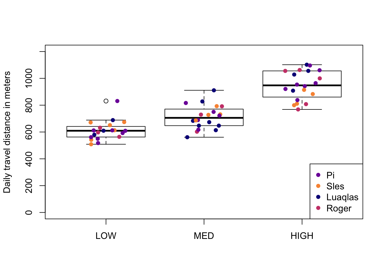
And now, just for fun, I’ll try to recreate the same plot, as closely as possible, using tidyverse’s ggplot2 package.
library(ggplot2)

#plot it
ggplot(df, aes(x = Fruit, y = DTD)) +
  geom_boxplot() +
  geom_jitter(aes(x = Fruit, y = DTD, color = Indiv), #specify colour by individual here
              position = position_jitter(width = 0.2, height = 0),
              show.legend = TRUE) + #add a legend of the point colours
  scale_color_manual(values = indivcols) + #vector of unique colours goes here
  ylim(0, 1200) +
  labs(title = "Daily travel distance by fruit level") +
  ylab("Daily travel distance in meters") +
  theme_classic()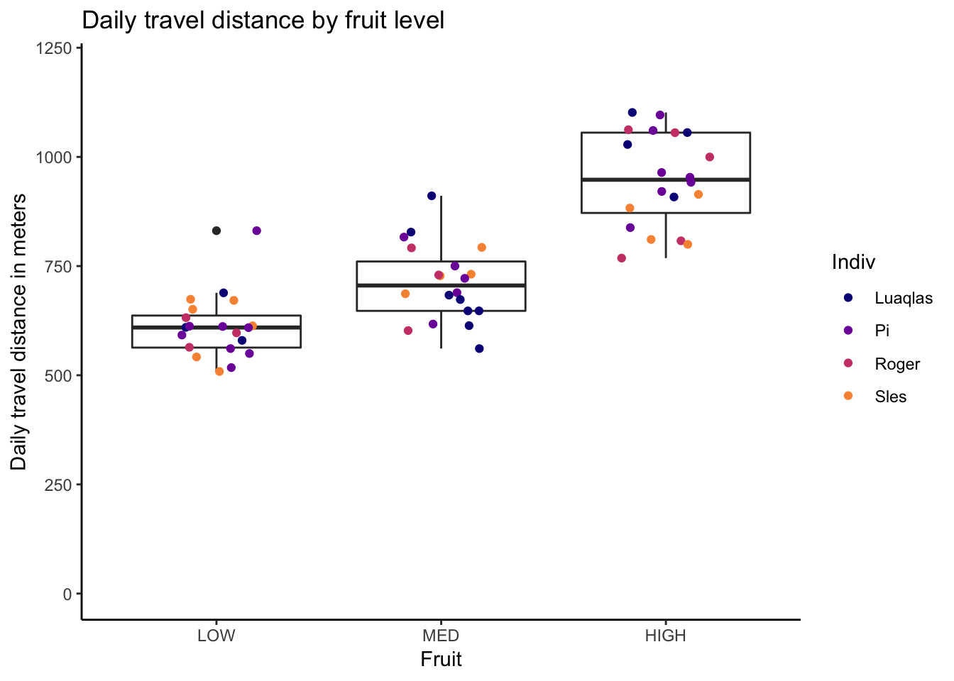
Notice how the ggplot2 function doesn’t require the full vector of colours for each point (i.e. the df$IndivColours column that I added for the R base graphics plot). In this respect, it is simpler and less cluttered.
Things to keep in mind when choosing colours
At the top of my list of things to keep in mind when choosing colours for plots/maps, in addition to the simple “Does this look nice?”, are:
- Are my colours distinguishable by people who have a colour vision deficiency? 3
- Are my colours distinguishable in greyscale? (if this will be printed)
- Do my colours reflect natural colours? In other words, is water blue, are forests green, are my topo maps on a green to yellow to tan to brown scale, are males blue and females red?
This really cool “Color Blindness Simulator” website allows you to upload a picture and then see what it looks like with all different types of colour vision deficiencies, including monochromacy/achromastopsia (total colour blindness), which (correct me if I’m wrong) is essentially akin to greyscale. So it’s really easy to check and see if your figures work for people who have a colour vision deficiency, and also if they’ll print well in greyscale.
Using colours that reflect natural colours might seem like a no-brainer, but - for me at least - it’s easy to get carried away making beautiful colour palettes and not realize that they might actually confuse my audience. I once presented the above topo map using the viridis colour scale and I was so delighted by it that I didn’t realize it looked like an ocean-floor topo map until my friend pointed out that it might have actually confused some people in my audience (seeing as my field site is in East Borneo, very much on land).
Footnotes
Note that, in
#rrggbbaahexadecimal strings of colours, the last two figures (theaa), which are optional, specify the transparency of the colour. I recently came agross this awesome blog post by Markus Gesmann wherein he gives a function that will transform any given colour (given by name, hex code, or rgb values) into a hex code with the alpha value (between 0 and 1) that you specify. Super simple, super useful function!↩In this case, with only a four-level factor, I’ve used nested
ifelse, however, if I’m trying to match to a factor that has more levels, I’ll often just make a little dataframe that is just the factor levels in one column, and the corresponding colours in the other column, then I merge this little dataframe to my main data, by the factor column. I’ve been trying to find more direct ways of assigning plotting colours to factor levels (in R base graphics), but haven’t found anything yet. If you have ideas about this, please comment!↩Having colour vision deficiency-friendy visuals may seem like a low priority on the list of things you need to worry about, but colour vision deficiencies are actually really common - about 1 in 12 males and 1 in 200 females have at least some kind of colour vision deficiency. So, if you’re presenting to a room of say, 20-30 people, statistically, at least 2 and maybe even 3 people (and maybe important people) won’t understand your figures if they aren’t colour vision deficiency-friendly.↩