
Pretty plots with predictions
I get a lot of questions about the plots in my conference talks, and I’ve been promissing a post about them, so here’s a first shot. I love plotting, and have recently gotten especially into ggplot2 and some of it’s many options and add-ons. I’ll also include some stats here, to show how to plot the results of of linear mixed model.
A hypothetical hypothesis
Let’s say that I want to know: How does DJL (day journey length, see the intro of this post if you want more info about what this means) change over the course of a female orangutan’s development?
Instead of using age to look at changes over time, I’ll use “stages”: 1) dependence (when she’s still with her mom), 2) independence (when she’s on her own), 3) adolescence (when she’s sexually active), 4) pregnancy (orangutans have an 8-month long gestation period), and 5) adult (when she has her first offspring). And, let’s say that I already know that FAI (fruit availability index) influences DJL: when FAI is higher, orangutans travel farther, so I want to be sure to control for FAI in my statistical analysis. Also, we’ll pretend that these data come from 4 different individuals (focals), and that we’re not interested specifically in differences between individuals, but we do want to control for that.
Click here to download some fake data that I’ll use in this blogpost. (Note: This is not real data. I made it all up. Any patterns/correlations in these data are not necessarily representative of what we actually observe among wild orangutans.)
Set up workspace…
library(tidyverse) #for plotting, etc (includes ggplot2)
library(cowplot) #for plotting theme - note that just loading the cowplot library
#will hijack the default ggplot theme of your workspace to make it cowplot
library(ggbeeswarm) #for different plotting point styles
library(nlme) #for linear mixed modelling
library(viridis) # for nice colours

load("the-right-directory-on-your-computer/DJL data.Rdata")
Exploration station
As always, we should begin by exploring these data and getting to know them a little better. Remember, our main question is: How does DJL change over the course of a female orangutan’s development (i.e. over the stages)? and we suspect that we’ll probably need to control for FAI.
#some trusty base R functions for checking out our data...

#structure
str(df)
#> 'data.frame':    688 obs. of  5 variables:
#>  $ FollowNumber: int  1 4 5 10 16 17 20 21 23 24 ...
#>  $ Focal       : Factor w/ 4 levels "Luaqlas","Ivoni",..: 1 1 1 1 1 1 1 1 1 1 ...
#>  $ DJL         : num  1033 857 923 1046 974 ...
#>  $ FAI         : num  2.11 1.91 2.31 1.21 4.3 ...
#>  $ Stage       : Factor w/ 5 levels "DEP","INDEP",..: 2 2 2 2 2 2 2 2 2 2 ...
#summary
summary(df)
#>   FollowNumber        Focal          DJL              FAI
#>  Min.   :   1.0   Luaqlas:183   Min.   : 490.5   Min.   : 0.169
#>  1st Qu.: 492.5   Ivoni  :226   1st Qu.: 807.0   1st Qu.: 2.844
#>  Median : 993.5   Bella  : 51   Median : 903.4   Median : 4.236
#>  Mean   : 990.1   Pi     :228   Mean   : 907.9   Mean   : 4.742
#>  3rd Qu.:1491.5                 3rd Qu.:1003.4   3rd Qu.: 6.399
#>  Max.   :2000.0                 Max.   :1356.2   Max.   :15.186
#>    Stage
#>  DEP  :103
#>  INDEP:182
#>  ADOL :159
#>  PREG : 75
#>  ADULT:169
#>

#some tidyverse functions that can help...

#put the stages in the right order (using a forcats package function)
df$Stage <- fct_relevel(df$Stage, "DEP", "INDEP", "ADOL", "PREG", "ADULT")

#get DJL means per Focal
df %>% group_by(Focal) %>% summarize(meanDJL = mean(DJL))
#> # A tibble: 4 x 2
#>   Focal   meanDJL
#>   <fct>     <dbl>
#> 1 Luaqlas    889.
#> 2 Ivoni      933.
#> 3 Bella      844.
#> 4 Pi         913.

#get DJL means per Stage
df %>% group_by(Stage) %>% summarize(meanDJL = mean(DJL))
#> # A tibble: 5 x 2
#>   Stage meanDJL
#>   <fct>   <dbl>
#> 1 DEP      924.
#> 2 INDEP    868.
#> 3 ADOL     985.
#> 4 PREG     871.
#> 5 ADULT    886.

#get DJL means per Focal per Stage
df %>% group_by(Focal, Stage) %>% summarize(meanDJL = mean(DJL)) %>%
                                  spread(Stage, meanDJL) #spread it into wide format so it's easier to read
#> # A tibble: 4 x 6
#> # Groups:   Focal [4]
#>   Focal     DEP INDEP  ADOL  PREG ADULT
#>   <fct>   <dbl> <dbl> <dbl> <dbl> <dbl>
#> 1 Luaqlas   NA   887. 1009.  903.  849.
#> 2 Ivoni    912.  858.  986.  832.  980.
#> 3 Bella    892.  822.   NA    NA    NA
#> 4 Pi       931.  905.  964.  851.  867.

#make some super basic plots... (remember that since we have loaded the cowplot library,
#all plots will, by default, have the cowplot theme)
#start by setting the cowplot theme font size for this workspace
theme_set(theme_cowplot(font_size=10))

ggplot(df, aes(DJL)) +
  geom_histogram(binwidth = 100)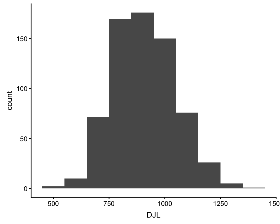
ggplot(df, aes(x = Stage, y = DJL)) +
  geom_boxplot()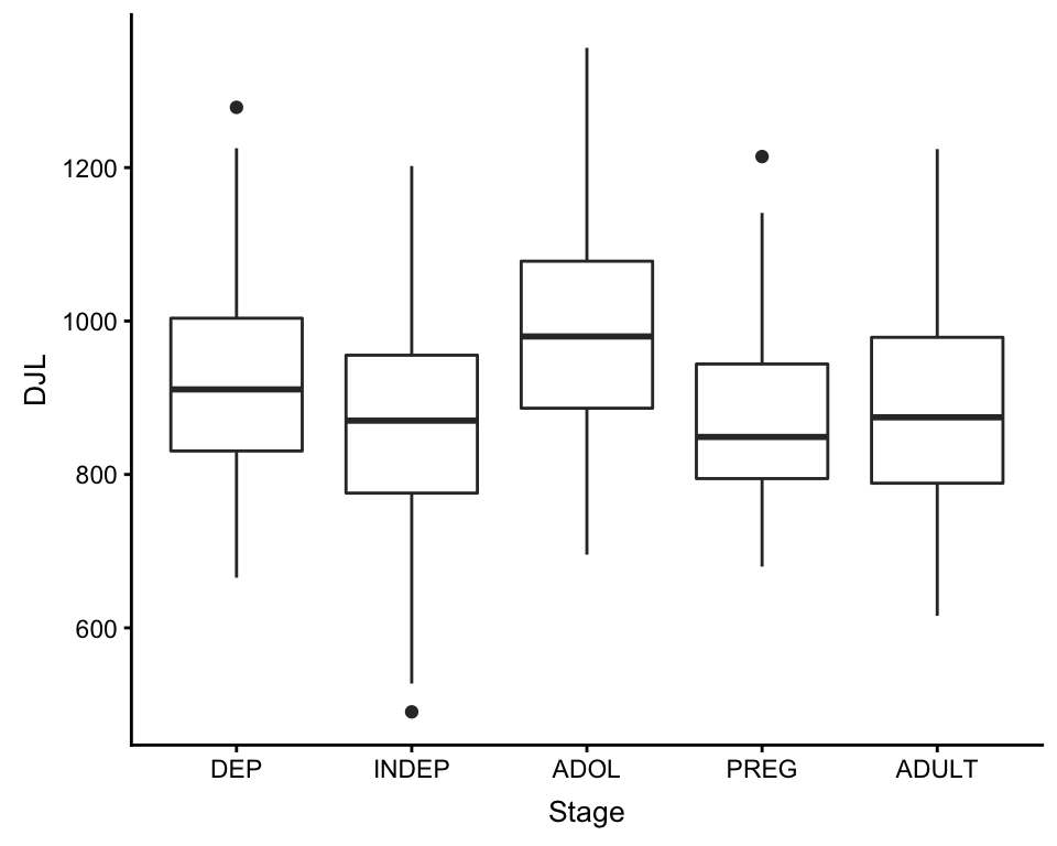
ggplot(df, aes(x = Stage, y = DJL, color = Focal)) +
  geom_boxplot()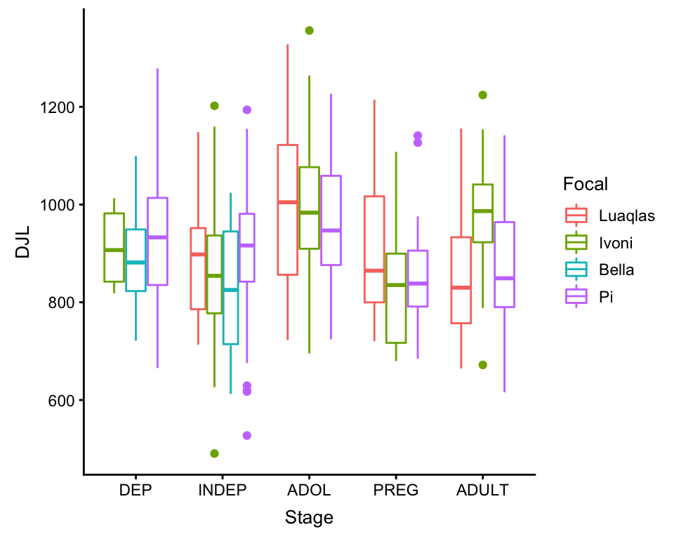
ggplot(df, aes(x = FAI, y = DJL, color = Focal)) +
  geom_point()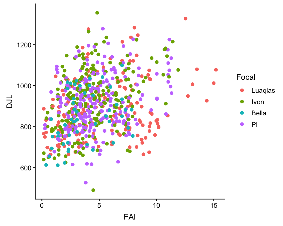
An LMM for these DJLs
Because my outcome variable (DJL) is almost normally distributed, and I want to include a random effect (Focal), I will use a linear mixed model. My fixed effects will be Stage and FAI. I will include Focal as a random effect because it is a level of replication in the data: the data within each level of Focal are less independent than between the levels of Focal. Personally, for LMMs, I like to use the lme() function in the nlme package, mostly just because it’s what I’m the most familiar with.
Because Stage is a temporally ordered factor, and I’m interested in changes over time, I’m going to use polynomial contrasts for the phase variable. This way, instead of comparing the first stage (DEP) to each other stage, my model will look for a linear, quadratic, cubic, and quartic relationship along the stages, basically treating the stages like a numeric variable from 1 to 5…
#set the contrasts
contrasts(df$Stage) <- contr.poly(5) #the number is the total number of factor levels

#run the model
model <- lme(DJL ~ Stage + FAI,
             random = ~1|Focal,
             data = df,
             method = "ML")

#take a look at the model summary
summary(model)
#> Linear mixed-effects model fit by maximum likelihood
#>  Data: df
#>        AIC      BIC    logLik
#>   8638.118 8674.388 -4311.059
#>
#> Random effects:
#>  Formula: ~1 | Focal
#>         (Intercept) Residual
#> StdDev:    15.28533 126.9349
#>
#> Fixed effects: DJL ~ Stage + FAI
#>                Value Std.Error  DF  t-value p-value
#> (Intercept) 830.2283 13.675354 679 60.70982  0.0000
#> Stage.L      -9.2698 12.881832 679 -0.71960  0.4720
#> Stage.Q      -8.2029 11.604820 679 -0.70685  0.4799
#> Stage.C      12.7765 13.023497 679  0.98104  0.3269
#> Stage^4      84.7546 11.377245 679  7.44948  0.0000
#> FAI          14.6878  1.986168 679  7.39503  0.0000
#>  Correlation:
#>         (Intr) Stag.L Stag.Q Stag.C Stag^4
#> Stage.L -0.092
#> Stage.Q -0.100 -0.226
#> Stage.C -0.338  0.008  0.068
#> Stage^4 -0.021 -0.169  0.088  0.248
#> FAI     -0.715  0.153  0.138  0.289 -0.028
#>
#> Standardized Within-Group Residuals:
#>        Min         Q1        Med         Q3        Max
#> -3.1128369 -0.7067194 -0.0227755  0.6815645  2.9390223
#>
#> Number of Observations: 688
#> Number of Groups: 4

#take a look at the residuals
plot(model)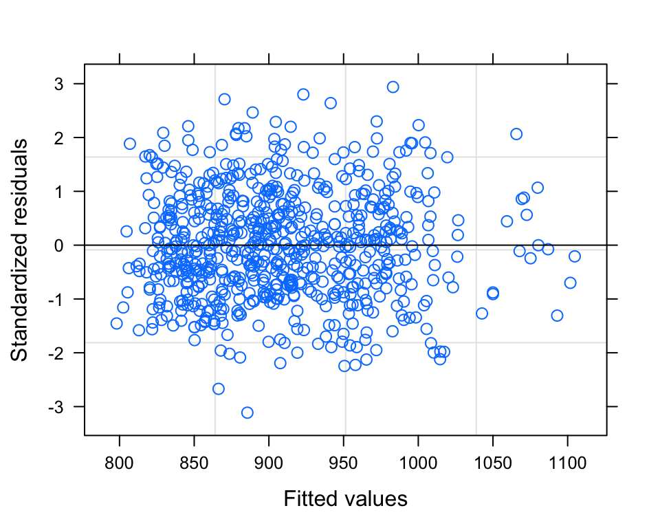
So, our alpha value is 0.05, and therefore our model summary tells us that there is a significant QUARTIC relationship between DJL and Stage (if more than one polynomial contrast is significant, you always choose the HIGHEST ORDER contrast). It also tells us that there is significant relationship between DJL and FAI. The model plot (standardized residuals against fitted values) shows a pretty nice cloud, with points randomly scattered around the plotting area - LOVELY.
Pretty Plot Plotting
Now, I’ll start by plotting these data - just the raw data. I’ll do a transparent boxplot, overtop of the actual data points, coloured by individual. I’ll use ggplot2 and two other ggplot add-on packages, cowplot and ggbeeswarm.
Note that just loading the library cowplot will hijack the theme of all ggplots made in your R workspace. You can easily override this by adding any theme_ ggplot argument to a plot.
bxplot_main <-
  # set up the basic ggplot parameters: data and aesthetic
  ggplot(df, aes(x = Stage, y = DJL)) +

  #set the theme's font size (this will override the general one I set earlier)
  #note that if I wanted to use another theme instead of cowplot, I could specify that
  #theme here instead (with theme_-----())
  theme_cowplot(font_size = 8) +

  #use a geom from the ggbeeswarm add-in to plot the points, set its own aesthetic
  #the quasirandom geom with its own aesthetic mapping (same as the overall ggplot,
  #i.e. the boxplot, except adding color = Focal)
  geom_quasirandom(aes(Stage, DJL, color = Focal),
                   #set how widely the points should be scattered
                   dodge.width=0.6,
                   #set the point transparency
                   alpha=0.8,
                   #setting stroke to 0 removes the outline around the points
                   stroke = 0,
                   #set point size
                   size=1.3,
                   #add these colours to the legend
                   show.legend=TRUE) +

  #override ggplots default colours and use plasma colours from the viridis
  #package instead, need four colours, one for each individual
  scale_color_manual(values = plasma(5)[1:4],
                     #override the default use of the factor levels (i.e. write names like this...)
                     labels = c("Luaqlas", "Ivoni", "Bella", "Pi"),
                     #override the default use of the column name (i.e. use this instead of "Focal")
                     name = "Individual") +

    #add the boxplot boxes, on top of the points - this will use the main ggplot
    #aesthetic mapping
    #set the transparency
    geom_boxplot(alpha = 0.4,
                 #set the outline colour of the boxes
                color = "grey30",
                #do not plot outliers (since we're plotting all of the points anyways)
                outlier.shape = NA) +

  #manually lable the plot and the axes
  labs(title = "Females, DJL by Stage",
       y = "DJL (meters)",
       x = "Stage") +

  #for the color legend, set the title manually (otherwise would use
  #column name)
  guides(color = guide_legend(title = "Individual",
                              #override the alpha value of the points, in the legend
                              override.aes = list(alpha = 1))) +

  #manually set the x axis lables
  scale_x_discrete(labels = c("Dep", "Indep", "Adol", "Preg", "Adult")) +

  #manually set the y axis breaks and limits
  scale_y_continuous(breaks = seq(0, 1500, by = 200),
                     limits = c(0, 1500))

bxplot_main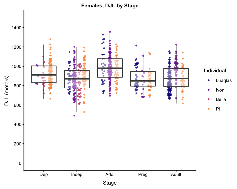
So, now, what I am most interested in here is, controlling for FAI and individual differences (accounted for by the random factor), the differences in DJL over the stages. So… it’s time to calculate model predictions, and plot those…
#make a dataframe with every possible unique combination of each factor effect,
#and the mean value of any continuous effect
interpol <- expand.grid(Focal = factor(unique(model$data$Focal)),
                        Stage = factor(unique(model$data$Stage)),
                        FAI = mean(model$data$FAI))

#now predict the DJLs for each row of the new dataframe
interpol$DJL<- predict(model, interpol, type= "response",
                       allow.new.levels= T)

#and now average those DJLs per Stage
DJLmeansPerStage <- as.vector(tapply(interpol$DJL, interpol$Stage, mean, na.rm = TRUE))

#add these mean model predicitons to the boxplot
#(there is probably a more efficient way to do this,
#but I haven't figured it out for ggplot yet)
bxplot_wPredictions <- bxplot_main +
  #for each phase, add a line segment that is a bit wider than the box,
  #start by mapping the start and end x and y coords; might need to
  #play around with the x coords to get the line segment as wide as you want it
  geom_segment(aes(x = 0.55, xend = 1.45, #start and end x coords
                   #start and end y-coords are each element in the DJLmeansPerStage vector
                   y = DJLmeansPerStage[1], yend = DJLmeansPerStage[1]),
               #some general graphical parameters...
               color = "black", alpha = 0.8, size = 1.4) +
  geom_segment(aes(x = 1.55, xend = 2.45,
                   y = DJLmeansPerStage[2], yend = DJLmeansPerStage[2]),
               color = "black", alpha = 0.8, size = 1.4) +
  geom_segment(aes(x = 2.55, xend = 3.45,
                   y = DJLmeansPerStage[3], yend = DJLmeansPerStage[3]),
               color = "black", alpha = 0.8, size = 1.4) +
  geom_segment(aes(x = 3.55, xend = 4.45,
                   y = DJLmeansPerStage[4], yend = DJLmeansPerStage[4]),
               color = "black", alpha = 0.8, size = 1.4) +
  geom_segment(aes(x = 4.55, xend = 5.45,
                   y = DJLmeansPerStage[5], yend = DJLmeansPerStage[5]),
               color = "black", alpha = 0.8, size = 1.4)

bxplot_wPredictions
And, if you want, you can calculate the parameters of, and plot, the a line to to show the quartic relationship. Dependending on the data and the relationship, this doesn’t always work, but when it does, it’s nice for talks and presentations, when you want to show exactly how a factor is significant.
#make a numeric vector to take the place of "Stage" factor
x <- 1:5

#make a y variable out of the predicted values per phase
y <- DJLmeansPerStage

#make a quartic model for y ~ x
pred.model <- lm(y ~ poly(x, 4))

#for plotting, make a dense vector of x-values from 1 to 5
x_vector <- seq(1, 5, by = 0.5)

#use the quadratic model to general y values for all of the x-values
y_vector <- predict(pred.model, list(x = x_vector))

curve_data <- data.frame(cbind(xvals = x_vector,
                               yvals = y_vector))

bxplot_wPredictions_wCurve <- bxplot_wPredictions +
  #add curve line, using the newly created curve df
  stat_smooth(data = curve_data, aes(xvals, yvals),
              #specify the type of geom (in this case, line)
              geom = "line",
              #some general graphical parameters...
              color = "grey70",
              alpha = 0.8,
              size = 3) +

  #now add some text to explain it, first specify the
  #type of geom (in this case, text)
  annotate(geom = "text",
           #specify the x and y position
           x = 4.5, y = 500,
           #specify what the text should say
           label = "LMM, p < 0.001",
           #some general graphical parameters...
           color = "grey70",
           size = 3,
           fontface = "bold")

bxplot_wPredictions_wCurve
#> `geom_smooth()` using method = 'loess' and formula 'y ~ x'
Et voilà. For talks, I usually use at least 2 of these plots, if not all 3, building them up step by step. To ensure that the plots all come out exactly the same size, I use the ggsave function…
#will save to current working directory, with the filename:
ggsave(filename = "DJL by Stage, full plot with predictions and curve.png",
       #specify which plot to save
       plot = bxplot_wPredictions_wCurve,
       #specify the file format
       device = "png",
       #specify the resolution
       dpi = 300,
       #specify the size
       height = 6,
       width = 6,
       units = "in")
Final Thoughts
A few things on my mind as I wrap this up:
- For talks, it’s always good to build up your plots - start with just the axes (put a white box over the data), explain them, then have the basic plot come up, then model predictions, or something like that, whatever you like… I just really don’t recommend throwing the final plot with model predictions and polynomial line at your audience all at once.
- This is NOT real orangutan DJL data. I made it up, just for the purposes of being able to write this post.
- Loading the
cowplotlibrary will hijack the defaultggplottheme in your workspace. I personally like thecowplotdefault much better thanggplot’s, but if you want to go back to theggplotdefault, just add+ theme_grey()to any ggplot code (or pick a differentggplottheme from here.
Links from this post
- What does DJL actually mean? Read the intro of this post.
- Download the fake data used in this post.
- A concise but thorough introduction to cowplot.
- A collection of usage examples of ggbeeswarm.
- A list of all of the different built-in
ggplotthemes. - A good introduction to linear mixed modelling with the
nlmepackages.
And of course, for any package your interested in, don’t forget to check it out on CRAN.